extending the parameters. i am working my way through my contextual study and discussing the extension of the rectilinear frame in the gendered framing of the landscape. i decided to redevelop a print idea that i started last october. whereas last week i extended landscape’s rectilinear frame through body (hand) manipulation. this time i extended the frame by exaggerating the horizontality of rectilinear frame – pushing the geometry of the rectangle which seems to have an opposite effect as if omitting rather than extending it towards a picturesque idyll. in my CS i discuss gendered association between geometry and rational thought – a binary to subjective acting on impulse. i do however work on instinct through the process of choosing colours, mixing quantities of pigment to medium etc etc. anyway here are some images of today’s printing process.


reflection: the a3 printer printed the bitmaps in striations which came out in the image exposure – more geometry of grids i suppose and almost like a fabric weave. i plan on printing it again at a smaller scale so i can print the bitmaps on my better printer even though i loved scaling up. oh well. i think this image as a black and white really suits the misty landscape. i’ll go at it again and add to this post when done. reminds me of all i have been saying about the unreliability of wet processes in my contextual study. if things were straight forward and perfect, i guess i should let a machine print it – clearly human intervention and the indexical mark is where its interest lies for me as an image maker. when printing i am always striving to make the image uniform – a battle between an imperfect bodily process and the perfection i strive for in my mind. i like the way the light in the top left corner also seems to leave the image unfinished – to be finished by the spectator using their subjective imagination to complete it.
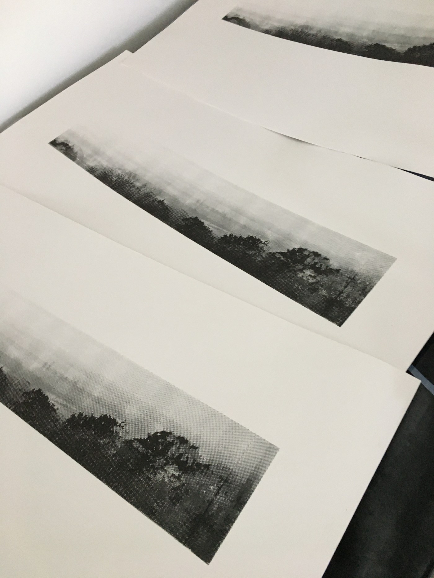
reprinting (07.05.20): i decided to go at this print again as i was unhappy with the quality of the bitmaps at a3 (must check the nozzles on my a3 printer). scaling down to a4 was yielded a much better print and the first printed layer contained so much detail that i thought nothing could be gained from over printing with another bitmap layer so i am leaving it as is. i reclaimed my screens straight away as i need to move on to my still and moving image development. i did keep an exposed screen with a 0 degree bitmap as i liked the look of the spaced pattern of the bitmap dots. i think i will mess around with another print using a coloured block as background layer and print this bitmap in black on top just to see – a working on instinct again and then a systematic process of repeated printing. when the shut down has started to loosen up i might try and get my bitmaps scaled up at a proper printers as although i love working small – i need it to be a choice rather than a necessity. anyway – here are the images from today.


reflection: there are often unintended qualities that emerge through physical printing – the more i print the more i anticipate the results but materials and human action can add (or subtract) unanticipated qualities to the work. in this print the vanishing of the image in the corner from light exposure seems to be saying something about the horizontality of the image – an omission or reduction of the landscape rather than an expansion. might explore this whitening out of the image at another time. maybe it connects with my incomplete landscape series. another area i want to look at also is the layering on top of 2 images a little like my triplopia and contemplating a mountain video installation work. no idea why i didn’t think of this already but it just came about when i saw the seams of the bitmaps exposed when i tried to connect 2 a4 bitmaps to make an a3 bitmap because my a3 printer is doing odd stripes when printing. i am also rethinking the title. its gone from sliver landscape to horizon to across these plains. – that’s what i thought of when the print emerged today. i googled this and see it is a chapter in R.L. Stephenson’s biography describing his arrival in the US. i usually start with a title that just differentiates one piece of work from another for myself. the second one came about when i was working on my contextual study which sits the best. i usually know when the title sits right. its not sitting completely right yet. makes me think about what i want the function of the title to be – either for myself or to hint at something that this work might be about… reminds me of my difficulty with the contextual study title too – trying to keep it simple and to the point is easier said than done.
… turns out posting on instagram provided the title – as far as the eye cannot see as i condensed what i was working on. of course that’s 6 words instead of 1 word in my contextual study.

Leave a comment