methodical approach to colour: following on from making day, where i went through the C and K of the CMYK screen printing process for a landscape image to test on my stereograph, i spent the rest of the day and weekend working through the MY of the CMYK process in a very methodical way. this is not something i usually do as i tend to go on instinct when it comes to colour. i guess if am going to develop a series (perhaps 3 editions) i want to be fully informed as to what colours choose for this. there is an immediacy to the 2 colour processes and more depth to the 3 colour processes. i went through the full 4 CMYK colours also but for technical reasons i laid down the yellow last so this really does not give me a real impression of the image in full colour. suffice to say, i do not intend to use the full colour range as i have found before that all colours give all information and loose some of the dynamics of the print in terms of texture and colour.


following through in the MY of the CYMK process

C,M,Y,K colour separation prints


2 colour variations of the CMYK process


3 colour variations of the CMYK process

full CMYK process although laid down in the order of CMKY so Y bitmap texture prominent.
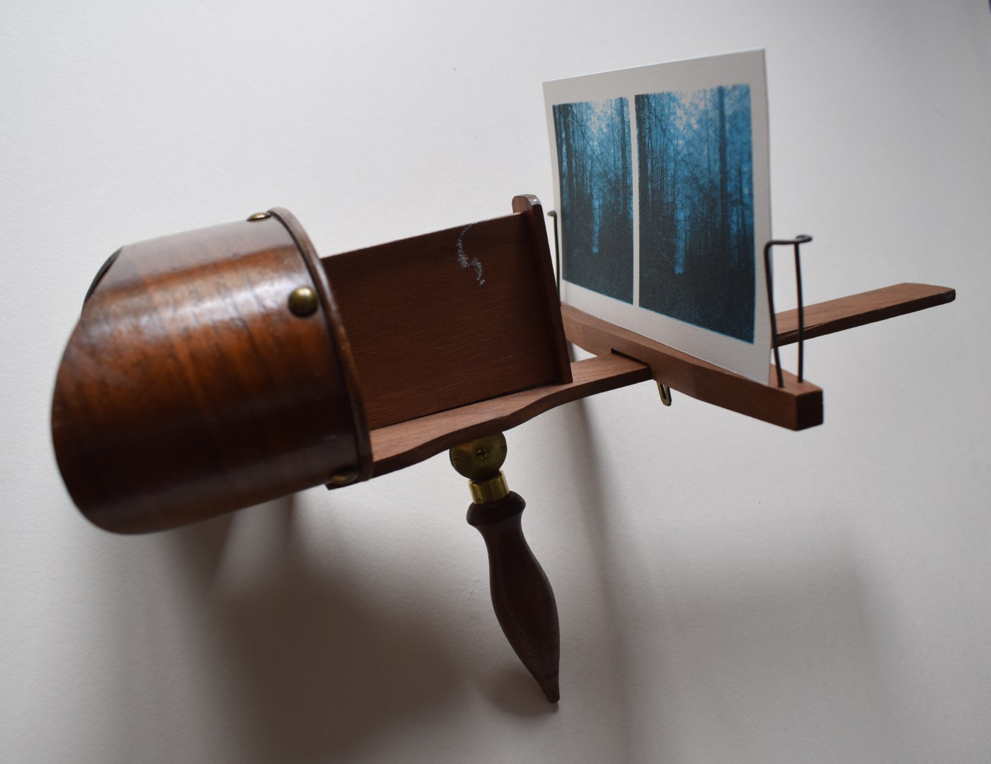
testing the landscape image through the stereoscope: not to loose sight of the stereograph framing which is a dual image with a slight shift, i cut my first print from making day and tested it in the stereograph. the stereograph is a lot clearer than i expected as i only ever remember my grandparents one being impossible to find the correct distance to focus – i am sure there is a lot of replaced parts to this ‘antique’ stereoscope that i bought on ebay and perhaps my eye sight has deteriorated since my childhood attempts which now brings the image together easier. i love the way these 2 images come together as one through this device and i love how the glass lens magnifies the print’s bitmap texture. not exactly 3d though but perhaps the image has added depth as a dual image.


going forward: i am reminded of the way 2 eyes see something at a slight shift from each other – it has a technical term which i can’t remember but must check this out – as image and body being so relevant to my work on landscape. i think this process would lend itself to a series where 3 or 4 stereograph images play off each other in terms of different frames of the same landscape and in terms of colour variations of the CMYK process. i also think i would like to develop a contact sheet print edition – a grid of frames of the one landscape at various distances of near and far and various colour combinations – it might be quite technical to prepare on photoshop but maybe worth a try sometime in the future. of course even the name ‘contact’ in contact sheet says something to me about landscape, body and image – lots to think about which is always good… i think the term is ‘binocular stereopsis’

Leave a comment