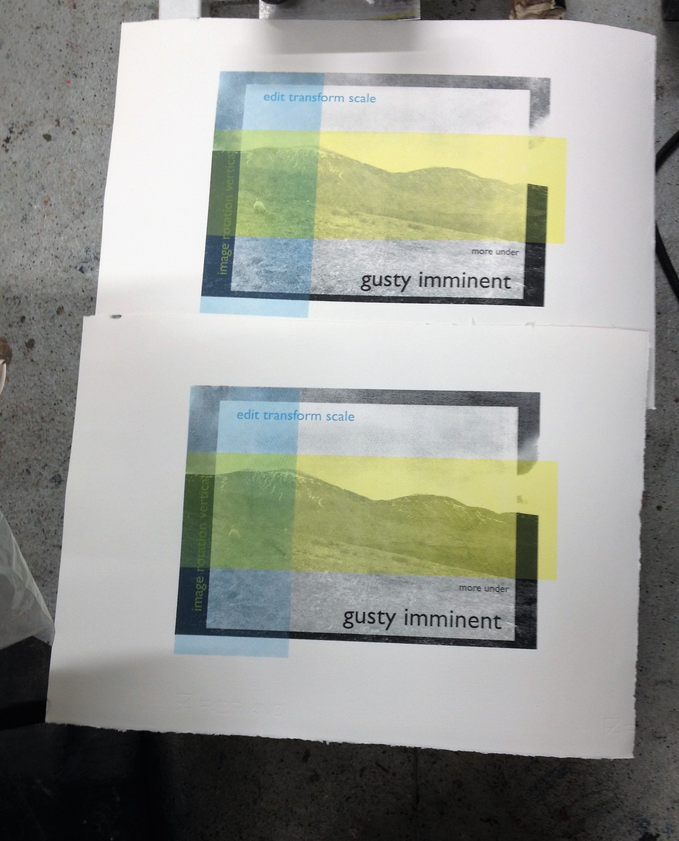
spent the last 2 days at Damn Fine Print Studios working on 2 editions of screen prints. part of my exploration of real and unreal landscapes tying into gender and how we view the landscape. the whole process of landscape image making plays with unreal, ideal and the physical reality of making an image. testing these out through landscape image making – real takes the form of text of the weather conditions on the day the images were taken. unreal takes the form of overlays of how i edit the landscape images; editing instructions both formal and informal, overlays of colour enhancements etc. ideal really begins at first manipulation of landscape by the lens frame at the point of capture. it continues more obviously (and sometimes automatically or unconsciously) in my edit of images for presentation or print. the break down of the image into dots and a bitmap also suggests the real and unreal of an image. in the process of printing the image, ideas of how the images should look and align plays against the imperfections of my hand and eye coordination and the physical action of print making; wet and messy. a constant battle between unreal and real as with every print i attempt to make clearer, straighter, neater, yet with every print new imperfections occur … landscape image making: i lie … i also leak
day 1 (07.05.18)


landscape image 1: i lie
day 2: (09.05.18)


landscape image 2: i leak
further reflection and technical notes: first exposure time for landscape 1 was 26 light units was too long and lost a lot of the image. new exposure time changed to 13 light units and might have been that bit too short but continued with printing. on day 2 i opted for 19 lu which was good but i think the density of my dots was too high and while i wanted dots to be visible i think the density caused too much banding. this screens had ghost images which i also had to work with. image right side up and screen frame up. vacuum on. light units set. on. hose both sides. work on each side until light through image. dry. tape frame and mask areas not to be printed. mix colours. serigraph inks were very thick and dried onto the screen too quickly. had to wet and clean screen and water dilute the ink. flood screen. whole image very grainy – even the colour overlays. used a lot of transparency medium (system 3) for the colour overlays. yellow is transparent anyway. changed where the yellow layer had originally be planned to go as the text needed a darker background for legibility. i think that the different texts might be too busy so the paler yellow meant they didn’t all call for attention together. did 2 pulls for yellow layer. mixed between 1 and 2 pulls for blue depending on how first went. take time with acetate registration to save time and frustration. newsprint paper picked up the image quite well as did the more expensive cold pressed rosaspina. wash with suds and dry between colours. end and reclaiming screen. wet front and back, wash. spray with cleaner front and back. scrub with brush. power hose screen with frame to back to avoid splashing. inspect the edition against the AP. select edition, number, title, sign. … frame or not…
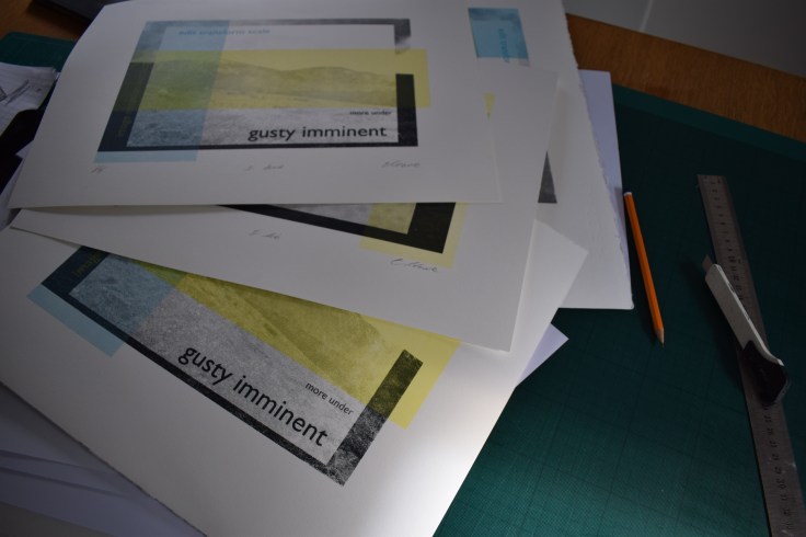
13.05.18: begun to select edition, title and date today getting ready for submission. i think that it will be interesting to see the physical screenprints against a computer version of the same images so i plan on getting these printed electronically next week and send them both off for assessment.
