as part of creating opportunities to reach out to a new audience and testing how far i push this through my making, i have started to work on a small double edition of postcard size screen prints to be posted to people who have not seen my work – maybe to start some kind of discussion or just seeing what will happen. as a double edition, posted on separate days, this seems like a good way to develop my ‘incomplete landscape’ print work and ties in with my ‘stereo’ lens work also.
first things first the postcard: before beginning to work on the image for the postcard, i did a little research into the history of postcards. it turns out that early postcards were initially hand-painted and then later printed as souvenirs of places visited, to advertise expositions or trade fairs etc. or had nude women on them. other points that came up include the divided or undivided back, the linen printing technique, bright CYMK processing or chrome colours and the increasing lack of human touch on the image as the decades progressed. in more recent history, postcard images have been mainly based on colour photographs with a glossy finish over the printed image. content of the images have also changed over the decades including the popular seaside images with ‘saucy’ double entendre texts. postcards have thereby raised issues about censorship and what images could be allowed to be sent and pass between counties. and in choosing the what and how of images for postcards, images have played a significant role in tourism and the branding of a country. particularly relevant to an irish context, the photographer John Hinde produced carefully planned, saturated coloured images of the irish landscape creating an idealised ireland which is considered an important document of social history. in her book ‘The Tourist Image: Myths and Myth Making in Tourism’ Elizabeth Edwards writes that postcard images ‘made the invisible visible, the unnoticed noticed, the complex simple and the simple complex. The power of the still photograph forms symbolic structures and make the image a reality’. I have also been looking into some of the work of Martin Parr who tackles the saturation and propaganda of images in humourous and unusual ways… a lot to sit with as i begin printing postcards.
image preparation: getting organised for making day and starting to print a postcard edition i cut the paper to standard postcard size (double size to cut down into 2 separate sizes after printing). postcard sizes have also steadily decreased in size and now a rectangular A6 size (105mm x 146 mm) is considered the standard postcard size. i over-sized the paper slightly to allow for any off registration. in preparing the image, i was interested in trying a seascape seeing as it has a long tradition in postcard history and of course an irish west of ireland seascape resonates with landscape as a myth for nationalism and national identity. i also liked the idea of using text – maybe with a double entendre of some kind – ‘made up’ as a fictional place, made up physically as a series of CYMK layers of dots and made up as 2 halves which the viewer can put together to complete the image. to make the best of my time on making day, i exposed the screens ready to go on the cyan and yellow layers.
making day: CYMK printing:
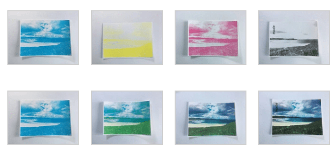
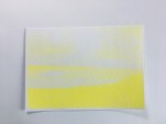
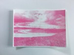
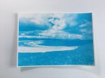
CY of CYMK: i hadn’t done CYMK screen printing before so i looked online for tutorials on colour separation – how to angle the bitmap for each layer of colour; C=15, Y=0, M=75, K=45. i decided to decrease the frequency from 45 to 35 to give it a more pronounced texture of dots. i also increased the contrast of each layer for exposure reasons mainly so that the black was as black as i could make it without losing detail. i exposed it at vac 80 and 180 light which worked really well for this image stencil, helped by the better quality of my new emulsion that i got last month. i was really happy with both the cyan and them the yellow in terms of image; they had a nostalgic feel to them – bright and hyper-coloured which Hinde might have appreciated. i guess the paper margin could have been wider as registration was slow because there was little room to maneuver the page.
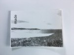
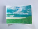
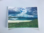
MK of CYMK: after making day cameras went off i continued to see the process through to the magenta and black layers even though i was excited by the cyan and yellow layers alone. with each layer more depth was added to the image and the black layer added the text which i think will work well on 2 separate postcards. the ‘up’ word is lost on such a dark background though.
reflection on CYMK: i feel that going through the CYMK printing process was very useful in gaining a real understanding of the physical making of a coloured image. i feel that there could be lots of fun with this process and lots of potential in disturbing or pronouncing the very systematic building up of an image. i don’t feel that printing this image through to the MK will be the image i use for the postcards and think i will revert to the more pronounced cyan and yellow colours. i also think there might be scope to play around with the image in terms of its scale or adding a stencil layer. i might even combine it with elements of another image so that it truly is ‘made up’… so my plan for the coming week is to reedit the image and print again with a less rigid CYMK process. i am aware that i need to work quickly and instinctively for this part of the project not because of a deadline but because i might find the intention of sending it to an unknown audience might bring out the impossible perfectionist in me which would stop me in my tracks.
references:
Edwards, E. (1996). The Tourist Image: Myths and Myth Making in Tourism. West Sussex PO19 1UD England: John Wiley and Sons. pp 199-200 ISBN 0-471-96309-7



Leave a comment